

- by Ave Machina |
- Original Avatar
- | Submitted on 12/27/2010 |
- Skip
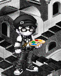

- Title: The Painter
- Artist: Ave Machina
- Description: Painting a gray world rainbow.
- Date: 12/27/2010
- Tags: painter
- Report Post
Comments (7 Comments)

- Ace Fehrs Mule - 07/12/2011
- @Pickachew: So, in other words, you hate it?
- Report As Spam

- Astroasis - 01/17/2011
- @Pikachew - Apparently, I need to preface every compliment I give on a specific element with, "I like your overall avatar, but I particularly like..." Fair enough. Could you please preface your critiques with, "I hate every avatar, but here's why I hate yours..."? If we work together, I think we can get our points across more clearly! biggrin
- Report As Spam

- Pikachew - 01/16/2011
- There is too much contrast. He could have toned it down a little with duller monochromatic skin such as gray body dye to give off a sense of belonging. He wouldn't be invisible since there are textural differences between the avi and the background. If you're willing to disregard the avatar base to compliment 2 hand held items and a background then you aren't seeing the avatar as a whole either. I'm saying that his base ruins the whole mainly because of the pastiness and attire.
- Report As Spam
- Ave Machina - 01/16/2011
-
Thanks, Vmeste.
I have pretty mixed feelings about this avi. Some of it I don't like much, but then I remember what most other entries look like. - Report As Spam

- Vmeste - 01/16/2011
-
@Pikachew 'His avatar is too bright'. This contrast is needed to separate the avatar from the background.
'No one has said anything complimentary about the avatar base'. Maybe because you are required to see the entry as a whole, not as separate elements.
Ave, this entry, though the theme has been done before, has been well executed. The use of that background, which is a well-known illulsion painting itself, further supports the 'artistic' theme. Well done. - Report As Spam
- Pikachew - 01/16/2011
- The "artistic" theme has been done before and this one is no better. Using items that already have a connection with one another, i.e palette with painting, isn't creative when the center piece, the avatar, is another bland monochrome that fails to match the tone and structure of the world he is in. His avatar is too bright. His clothes are confusing. Have you realized no one has said anything complimentary about the avatar base at all? A palette and background shouldn't carry the entire entry.
- Report As Spam


