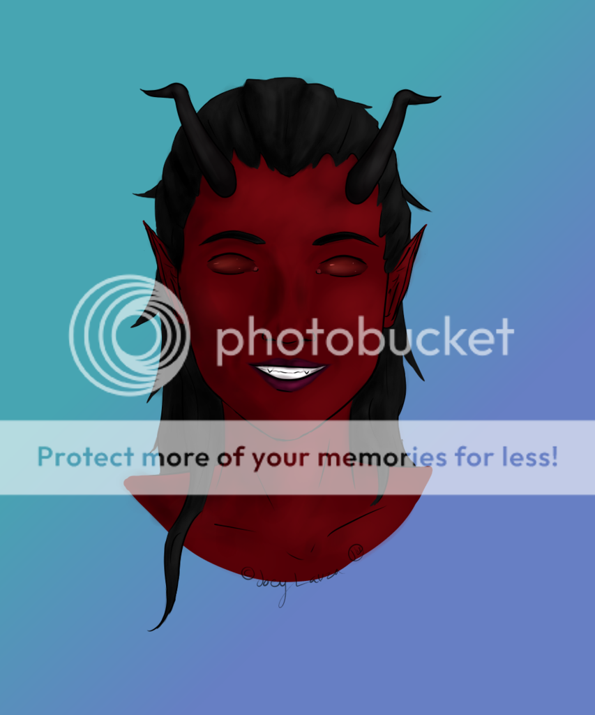
- Title: The vampire
- Artist: borgny
- Description: my deviantart: http://miiyako.deviantart.com/
- Date: 03/22/2010
- Tags: vampire
- Report Post
Comments (5 Comments)

- XxX-Limez-RaWrZ-XxX - 03/25/2010
- Very nice! 5/5
- Report As Spam

- Phantom-of_Winter - 03/25/2010
-
-continued-
cyclopse. You should always keep two eyes visible. You do a very good job at detail and coloring. Maybe trying to make your characters a little more relastic - anime style? 4/5 - Report As Spam
- Phantom-of_Winter - 03/25/2010
-
I'll add on to green_eyed ghost critique.
Yes, there needs to be something more going on in the background. I say this because there is too much negative space. Perhaps adding more roses that expand from the corner?
The mouth, I do agree, it looks odd. Perhaps the mouth might need to be move down from the nose (and might need to be strecthed a little bit to the left).
I know you're trying to make it look dramatic, but having the other eye invisible in the shade makes her look like she's a - Report As Spam

- chiquita55 - 03/24/2010
- NO I THINK IT LOOKS JUST FINE I LOVE EVERYTHING MOSTLY THE ROSES AND TO MUCH DETAIL IS WEARD I LIKE IT JUST THE WAY IT IS 3/5
- Report As Spam

- green_eyed_ghost - 03/22/2010
-
needs work.
1. add a background (besides the roses in the corner, they are good though)
2.the mouth looks a bit odd, you should resolve that
3. maybe a second eye? - Report As Spam