For the winners
1st:Gomeric
2cd: ChewbaccaBigSis
3rd: Nikkic87
Something new! (And we'd love some feed back on this as well, if you guys want us to continue it or not)
We thoughed we'd leave a comment on everyone who's posted work, and let them know what we thoughed about there submissions... maybe somethings could be helpfull... or maybe you'd rather not know... like I said this is new so let us know what you think : 3
Comments on all artist work
Om: Om you did a really good job on this drawing, its one of your best I've seen so far. Your always improving and thats what I like about you : ). Your entry was very nice, it had a nice curvature, and style to it. In terms of colours you did an awesome job by putting the bright yellow to make your character stand out more, we would have loved to see you use that same methode with the face and make your characters face/eyes (because these are natural focus points) stand out more. In your current submission its mainly his jacket that stands out and not the hole character, which is still really good, but just something to keep in mind for your art work. Your eyes can still be red : 3 just try to avoid using the same red that you use in your background to make them stand out more.
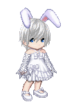
Hipster: You girl have got an amazing talent for what you do. Your creations are adorable and your work is truly inspiring. We loved the fact that you participated in this month contest its always fun to get people who do different art mediums other than drawing to participate. : 3 Your submissions were very beautiful as well, we loved how you used vivid and bright colours and how thoughs colours matched well the colours of the original pokemon. Unfortunatly I think you were a little disadvantaged in this months contest because of the theme. We unfortunatly couldn't really credit you on the choice of colours because these pokemons colours were already pre-determined by its creators. So again, you do amazing stuff, and we'd love to see more from you, but we don't think this months theme was to your advantage. Thank you for participating : 3
Pyrien: You are a crazy girl!!!! you always have so many submissions, your a really hard worker thats for sure : 3 We really love getting work from you, your stuff is lovely and were always seeing a small improuvement on your end as each month goes by. : ) Out of your submissions the one that got our attention the most was this one (http://i1235.photobucket.com/albums/ff437/Lady_Pyrien/bookmarks.jpg) we found that this one had a really lovely palette colour and we loved seeing you work your colours in the wings of your dragon flys and in your leaves. As a general image its very lovely, but because were judging your work we just wanted to just point out something out to you for future reference. While your drawing was very lovely all together, we noticed that certain areas lacks a little colour contrast. Your image uses many cold colours (greens, purples and blues) and has only one warm colour, the moon which is yellow. This is great because it creats a center of attention, you eye is automaticaly directed towards the moon. But its would be nice to see just small sugestive warm colours (either oranges, yellows, reds, pinks or something like that) on the rims of your flowers or vines... mainly cause theres so much detail in your vines and flowers, it seems a little shame that our eyes attention goes straight to the moon instead of more on all the details you put on the plants themselves. If you could just contrast your cold colours a little more it would really help improve your colour composition. But other than that its a very lovely drawing and we'd like to thank you for participating : 3
Lyle k Nives: beautifull beautifull beautifull hair. It looks very cute and fluffly and smooth and ah! simply gorgeous. Your submission was very nice we loved all the work you put into your shading, and we especially love the way you did the hair, it came out amazing. Your colour palette was lovely, but our attention often distracted and went towards the syth as well... This is primairaly because your character colours were composed only of warm colours (disregarding her eyes, but because her eyes are so small in compairison to the rest of her body we have a hard time seeing them) while your syth had a bright cold colour. This is not a bad thing, re-directing the eyes attention like that is very good, and usefull thing. We just felt it would have been nice if the character stood out more than the syth... Which could be corrected by adding more cold tones on your characters, maybe cold colour shadows, that go towards teints of blue or purple in stead of warm colours like reds. But other than that its a very lovely image, it was very nicely done and we'd like to thank you again for your submission : 3
Zaleha: Lovely details in the hair, and the swords. We especially love the movement in the locks of hair you gave. It really created life in the drawing. The overall colour contrast of your image was successfull. However just a little comment here, we felt like the backgrounds contrast was a little to intense.... the bright vivide colour behind a pale character made us feel like the background stood out more than the character her self. Which isen't always a bad thing, but because your character was the only subject in your drawing we would have liked to see her as the mains subject. This could easoly be fixed by bringing down the saturation level of the background. Its just a sugestion but none the less your drawing was very lovely and we really loved seeing it in the competition, thanks for participating : )
Luzhikari: Ah luz! you have such a beautiful drawing style, its very soft and fluid, and we love seeing work from you. The submission that got our attention the most was actually this one (http://i1214.photobucket.com/albums/cc493/luhikari/Arts/littlegirl.png) because she was more deffined and fit more the criteria of the colour theme we had this month. Over all, we loved the shading you did. We even noticed how you tried to add som taints of green in her stin which was great to see. We did however feel her skin colour was a little to uniform. Other than the lower part of the body that had some slight varients in colour we felt like the face (which is the center of our attention) was lacking a little bit of colour. We did however Love the contrast you did between the cold colours (green of the eyes) and the warm colours of the skin. It was a lovely submission and we really love getting work from you : ) thanks for participating and we hope to see more from you in the future.
Chewbacca: COlour MADNESS!!!! omg I've never seen so many colours... thats just crazy!!! : ) it totaly rocks! You definitly blew our minds away with all your vibrant colours! We loved the degredation of colours you put in your drawings, the skeleton colours were my favorite, everything seemed to me pretty darn colourfull! love it! The mix of mediums was very creative as well. One thing I will mention though is our attention went a little every ware. There was so much colour in every direction that it made it hard to see all the details you put into the drawing... But it was still a very nice submission : 3 thank you for your entrie
Nusith: as always your water colour drawings are always so impressive, you have a keen eye for details and we really love how much attention you put into your work. We also love the movement/posing you put in your drawings there always so dynamic and full of personality.
Cake: You had a gorgeous submission, we loved the variety of colours you offered the background along with all the details you put into it. The only comment we had was we didn't feel like the characters stood out as much as they could of, they kinda felt like they were blending into the drawing, especially the girl behind the man. If you could avoid using the same red in the background as you use for your character maybe this could help contrast your main character enough to stand out... that or use cold colours like blues or purples or greens for the background instead. But thats pretty much all we have to say, the rest is very lovely. The degrading of the colours of the mans mask, from white to black is very lovely, we even loved seeing the splats of paint you put over his cloths, it really gave your drawing a nice feeling to it : 3 Thank you for your submission
Stickey: Hmmm it was an interesting submission, we loved the avi's costume you made, and full details on the stuff in the background, but unfortunatly we had a hard time making out the colours because it looks like the drawing was taken by camera. So we can only see a little bit of green and just a very slight colour of brown I believe. If it would be possible to sit the drawing down in a well lite area the next time it could really help us out. Because as I said, we had a hard time evaluating its colours due to the soft colours not comming out well with the picture. But thank you for your submission anyways : )
Mori: Ahhh such lovely stuff, I loved the colours you put in your movement for your submissions quick kick. The over all colour palette of this drawing was very nice, we especially loved how you added hints of lighter colours to defined a back lighting, and the bright colours of the face in compairison to everything else really stood out. It was very well done. We would have loved to see a little more detail of some kind in the background, but other than that its a very nice image.
Crazy: Ouuu a lovely eater drawing, and we love how you took on drawing more than one character it really helped build an enviroment around your characters. As a general image it looks like a nice fun drawing, to share with friends and loved ones. We would have liked to see you play a little more with your colours though, maybe add more colours in the shading of the dress, or hair... just small things to help define more your drawing but its still very nice. Thank you for participating : )
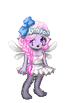
Virtual Reality: Your entry was a very soft and elegant drawing. We loved the pastel feal you gave your image and the little blur you put around your character really emphasises our attention on there face which was nice. We would have loved to see more contrast in your image how ever. The soft colours merge a little together, even though the cold colours seperate well from the warm colours, it would have been nice to see just a little more bold contrast in the image... something to direct out attention with colours instead of just a blure. But all in all its a lovely portrait and we would like to thank you for participating in this months entry : 3
Gomeric: Fuu Fuu Fuu! I remember seeing the sketch of this one. And my what an improvement, you really went hard core into the details didn't you ! The attention you put towards the details in the curtons or mirror cabenet is very lovely. We LOVED how you played around with the characters skin colours!!! It was so gorgous to see skin with tains of pinks and reds, and browns and purples in them... it really made the legs in particular really stand out! beautiful simply beautiful. One remarke that was mentioned however was that the colour pallette over all seems a little uniformed... we have many cold colours and very few warm colours... one of the things we found stood out the most colour wise was the stuffed teddy bear on the floor, because its bright red colours really contrasted with the soft cold colours that surrounded it. And even thought the character has some warm colours, it would have been nice to have seen the main character stand out a little more colour wise. Maybe with a warmer background wall? In anycase other than that we really have nothing to cretic on. The shading is lovely and the details amazing as I mentioned. Its a really lovely piece of art : ) thank you for participating and we hope to see more from you in the future!
Nobody's fault: Loved the concept, made us think of the smiling cat in alice in wounderland. The red blood really contrasted with the rest of the image as well. We would have liked to see more definition in your colouring though... everything was a little uniform, straight blue colour, pure red colour and so on. Which is ok, we were just hoping you'd go a little further with your drawing. : ) Thanks for submitting!
Beatrix White: I love candy... I love candy... I love candy and I love your candy store XD!. Seriously the colours in your submission were very fun and cheery you did a lovely job with the shading and details in the bunny ears and hair, we even loved how you put the extra effort into shading the knuckles of your fingures it really made it stand out. Ummm the only thing I wanted to say, is that because your characters colours were mainly desaturated (so grey) our attention is mainly put towards the background which is very colour full and full of life, our eye kinda looks at him, but is quick to want to jump to see all the details in the background... which is generaly the opposite thing you wanna create. If you ever draw a character with lots of greys or blacks in there design, maybe try putting a more plain or simple less colourfull background. So our attention stays more focused on the main character, you could even add a little bit of colours in your characters, maybe some very light traces of blues in the shadows of your characters grey cloths, just to give it a little more colour variation and add a little something more to the colour palette. But other than that its a very lovely drawing.... its a pity the background was all blured out, I would have loved to see what kind of candies were in though candy pots : ) hehe
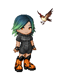
Kiki: Ah kiki we loved your colourfull drawing, its full of life and the cute little chocolate coloured bunny in the background is always a win!. In general we loved the colour variation you gave your drawing. We had loads of colours and they all seemed to work harmoniously together, which was really nice to see : ). YOu did a nice job adding a little more depth in your image with adding a darker colour of shading of the same colour. But we would have liked to see you explore your shading with maybe a different colours... your chickies were really cute, but because the shading is done in the same colour we have a hard time seeing it... So a little more defenition with the shading/different colour would have maybe helped here. But other than that its very nice, and you did a really nice job : ) still loving the colours! thanks for entering!
Koichi: ah koichi, you always have such lovely detailed images! We really loved how you rocked the hair in this submission, the shading was beautiful, and we really loved how you played the the colour contrast of the characters jacket. We would have, however liked to see more colour in your drawing. Because this month theme was colour the red in your drawing was very bold and dynamic, but we felt it wasen't enough colour on its own for the colour theme contest this month. But as always you have such wounderfull drawings and we really hope you'll compete again in the future contest : )
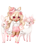
Shiroi: Awwww your drawing was so lovely... like a princess! We loved the movement you gave your gown and the flowered background was a really lovely touch as well. Your colours worked well together/beautiful colour harmony, and we loved how your character stood out because of her warm skin colours v.s. the cold colours of the background and dress which were purple. We would have however liked to see a little more variety of cold colours to contrast in your image than just purple and black, maybe some blue or some green? just something to hint another colour with out taking the attention away from the main subject. But other than that, you drew a very lovely art work and it was really nice to see in this months competition : )
Nikki: I love the style and feel of your drawing. We found the colour composition very nice and works harmoniously with each other. It wasen't an overly detailed drawing, but for the colours that were there, it really stood out. We would have liked to see more details in certain bright areas like the fluffy parts of the hat or bottom of the skirt but other than that it was a very lovely drawing and we loved how the colour composition was done... it really turns out great even in a thumbnail view, great job : )
Amandelie: I don't know how long that drawing took you to colour in, but we are loving the details and shading work you put into it : ). We love how each character was seperated by there own colour but the colours were still vivid enough to mix well together with one and another. We do however feel a slight confusion of colour intensity from the main character the girl in the middle with the masked man behind her. We think this is because there coulour saturations are to close together causing the colours to seem to merge together, you could maybe try bringing the colour saturation of the character in the background down.... so the main character sticks out more. Like she does with the other girl beside her (she stands out well over her) But yea other than that, lovely colours, and use, we love the gaming battle poses, and the vivid colours really attract our attention : ) its a very lovely art piece
Xadiara: We loved how this came out, the shading and colour harmony is beautiful and works well with one and another. The background is detailed but not enought to take our attention from the main character. The colour red contrast over the blue is nice however this does take away our attention from the main character, since she's waring blue-ish clothing as well, and merges a little with your background, were as the bright vibrant red colours really re-direct our attention. Which isen't bad, we would have just perfered if it was the main character that was standing out like that... maybe if you swaped her clothing colours to a warmer colour and more vivrant like that of the laterns she could stand out more. But yea thats all we had to say, it really is a lovely drawing and you really did a wounderful job on it : )
______________________________
Welcome to the "Artist and Art collectors paradise" monthly art contest.
What is the contest?
The contest is a way for the guild to show what kind of talent our members have.
How do I apply?
To apply, simply fill out the the fallowing form, and attach a drawing that shows off your talent as an artist. You may submit as many drawing as you'd like, so long as the drawing was done by you, and made during the month of April 2011. You may use art you did for commissions however you will need the approval of the client you did the art for (which in most cases I do not think this will be a problem)
Quote:
Application form
Name:
Medium used:
If this is a commission, who commissioned you : (we will contact the person just to make sure they said it was ok. If this does not apply to you please put N/A)
Submission :
This month contest will be judged on excellent use of colours.
(also a small thanks to hellosara who suggested some ideas for the monthly contest : 3)
Whats the prize?
-1st place, 300k, plus your image will be displayed in the guild home page for the month of May
-2cd place, 150k
-3rd place, 50k
When is the end date?
The end date will be April 30th, 8 pm (eastern time zone)
(if you have any questions, please feel free to post them and I'll try to answer you the best as possible)
Q:
I don't draw, I use another medium to do my art, can I still compete?
A:
YES, if your a photographer, you may submit an awsome photo you took during the month. If your a sculpter you may submit an amazing sculpture you did during the month, and so on. This contest is open to all artistic mediums.
_____________________________________________________________
List of participants
iTaintedOm
HipsterCrochets
HipsterCrochets
Lady Pyrien
Lady Pyrien
Lady Pyrien
Lady Pyrien
Lady Pyrien
Lyle_K_Nives
Zaleha
luzhikari
luzhikari
ChewbaccaBigSis
NuSith
CakeColour
xStickyFingersx ii
mori-zae
Crazy_Cassidy15
Virtual_Reality_Syndrome
Gomeric
Nobodys Fault
NuSith
Beatrix White
KiKi_xoxo497
Koichi
Shiroi Rikune
Nikkic87
NuSith
Amandelie
Xadiara