Welcome to Gaia! ::

An Artist And Art Collectors Paradise

Back to Guilds

art, artists, aviart, collector, 100 days 

Tags: arts, friends, artist, event, collector 

Reply Artist Corner
Shading fail? Goto Page: 1 2 [>] [»|]

Quick Reply

Enter both words below, separated by a space:

Can't read the text? Click here

Submit

Brainy Mary

Hilarious Fatcat

4,375 Points
  • Signature Look 250
  • Wall Street 200
  • Millionaire 200
PostPosted: Thu Mar 10, 2011 11:23 am


I'm drawing from a photo, and there isn't much shadow in it so I'm trying to add my own, but I don't think it's turning out right. Here it is:
User Image
PostPosted: Thu Mar 10, 2011 2:58 pm


Would you like a full out critique or just a shading critique? And may I see the photo?

just hades

Dapper Spotter


Brainy Mary

Hilarious Fatcat

4,375 Points
  • Signature Look 250
  • Wall Street 200
  • Millionaire 200
PostPosted: Thu Mar 10, 2011 3:21 pm


Marchen de Lune

Would you like a full out critique or just a shading critique? And may I see the photo?

A full out critique would be nice. I'm not trying to copy the photo exactly so I don't think that would help.
PostPosted: Thu Mar 10, 2011 3:23 pm


Brainy Mary
Marchen de Lune

Would you like a full out critique or just a shading critique? And may I see the photo?

A full out critique would be nice. I'm not trying to copy the photo exactly so I don't think that would help.


I understand but I still need to see it to see the shadows themselves and give full explanations and such. It would help me a lot.

just hades

Dapper Spotter


Brainy Mary

Hilarious Fatcat

4,375 Points
  • Signature Look 250
  • Wall Street 200
  • Millionaire 200
PostPosted: Thu Mar 10, 2011 3:25 pm


Marchen de Lune
Brainy Mary
Marchen de Lune

Would you like a full out critique or just a shading critique? And may I see the photo?

A full out critique would be nice. I'm not trying to copy the photo exactly so I don't think that would help.


I understand but I still need to see it to see the shadows themselves and give full explanations and such. It would help me a lot.


The girl right here:
http://www.plusmodelmag.com/General/plus-model-magazine-article-detail.asp?article-id=209898350&page=4
PostPosted: Thu Mar 10, 2011 4:10 pm


For starters, it is always best to change a photo in to grayscale in order to get all the values for shadows. In color it is hard to tell ALL values that is to be translated in the gray tones unless you have studied the value range very heavily. Many portrait artists will convert photos in to black and white/grayscale to acquire the most accurate shading.
See?
User Image
There is very little actual white areas. Meaning there would be very little white areas in the pencil translation as well.

Now.
I understand you are drawing someone that is not of typical "thin structure" but there are still some anatomy structures to keep in mind.
Mostly in the face and the body itself.
See?
User Image
I kept the width of the body itself but still kept proportions like in the photo.

Lastly, the way you changed the pose makes it very stiff and a bit unnatural. I suggest either keeping the arms how they are in the photo or relaxing them against the side of her body to give it a more natural position.

I hope this helps and I do think it was a good start!

just hades

Dapper Spotter


Brainy Mary

Hilarious Fatcat

4,375 Points
  • Signature Look 250
  • Wall Street 200
  • Millionaire 200
PostPosted: Sun Mar 13, 2011 10:00 pm


Marchen de Lune
For starters, it is always best to change a photo in to grayscale in order to get all the values for shadows. In color it is hard to tell ALL values that is to be translated in the gray tones unless you have studied the value range very heavily. Many portrait artists will convert photos in to black and white/grayscale to acquire the most accurate shading.
See?
User Image
There is very little actual white areas. Meaning there would be very little white areas in the pencil translation as well.

I'm worried that shading the drawing that much is going to make it look cluttered and gritty. Do you have more specific suggestions?
Marchen de Lune

Now.
I understand you are drawing someone that is not of typical "thin structure" but there are still some anatomy structures to keep in mind.
Mostly in the face and the body itself.
See?
User Image
I kept the width of the body itself but still kept proportions like in the photo.


The width of the body in my drawing is much closer to the photo than the example you suggest, as is the ratio of head to body.
PostPosted: Mon Mar 14, 2011 12:38 pm


Rule number one of asking for crits: try not to get defensive when people give you them. It's important to bear in mind that this is what you asked for, and that people take the time and effort to give criticism in order to help you improve as an artist, not just to be mean and tell you off.

hellosara
Crew


Brainy Mary

Hilarious Fatcat

4,375 Points
  • Signature Look 250
  • Wall Street 200
  • Millionaire 200
PostPosted: Mon Mar 14, 2011 1:23 pm


hellosara
Rule number one of asking for crits: try not to get defensive when people give you them. It's important to bear in mind that this is what you asked for, and that people take the time and effort to give criticism in order to help you improve as an artist, not just to be mean and tell you off.

I wasn't trying to defend my work. If anything, I was complaining about the quality of the critique. Regardless, I understand how that could be construed as hostile. My intent was to bring attention to that piece of advice not making sense to me.
PostPosted: Mon Mar 14, 2011 6:31 pm


I am sorry my advice was not good enough.
I was only giving and showing what I know.

just hades

Dapper Spotter


Kai_Chi
Captain

PostPosted: Mon Mar 14, 2011 8:16 pm


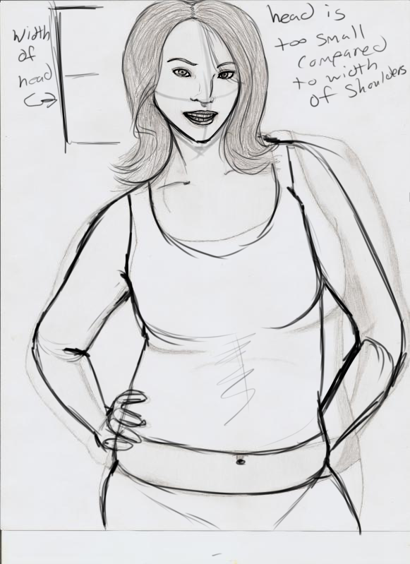
I think lune was just trying to point out more the structural values in your drawing more than the forms itself. I think she did only a quick sketch to help point out a few things, with out taking everything in the drawing to seriously, it was just a reference sketch 3nodding
__________________

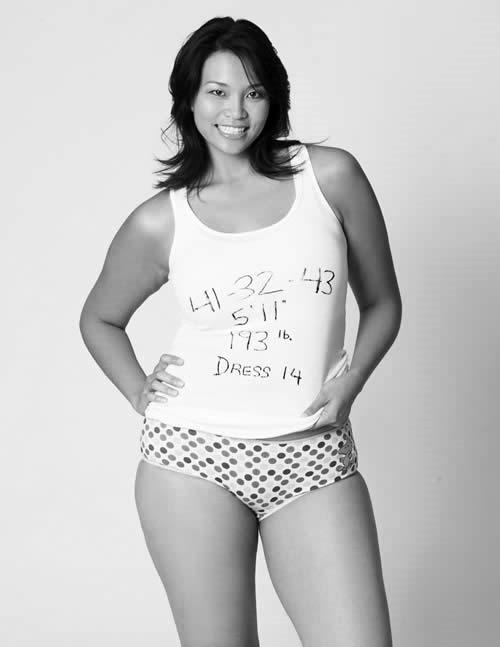
In your drawing I would be a little carefull about certain forms like the right hand, thats hidden behind the back... In your image it looks a little to narrow for the bones and muscular structure the women in your reference image has... I can see were you were heading with it, in representing the same incline she has, but because her hand is coming towards us in the picture, which creates a distortion in the perspective that gives you the result you have in the picture. But in your drawing you chose to hid it behind the back... which is ok, but now the perspective dosen't work the same, cause the placement of the hand would not rest the same way if her hand was placed behind her back, and there for the distortion of the arm would not look like that... Its an easy mistake to make, 3nodding I've done it a few times myself, when changing posing. Its just something to look out for on your next drawing 3nodding

I like the way you've tried to incorporate a little more shadow into your drawing this time...it helps define more the volumes 3nodding but don't be scared to push it even further. A lot of your shading only goes out to the minimum of what it could, because your still trying to avoid making your drawing feel griddy... But I think this is un avoidable with a pencil medium. Because in essence a pencil gives off a griddy feeling to it... Even when I do my shading I get this griddy feeling, and I make sure to work on quality pieces of paper as well as top notch drawing pencils and I still get that feeling.

Examples of my sketchs... and ummm warning... there nude, cause they were life drawing observations ._.

http://s5.photobucket.com/albums/y164/Kai_Chi/?action=view¤t=guy_life_drawing.jpg

http://i5.photobucket.com/albums/y164/Kai_Chi/woman_life_drawing_01.jpg

http://i5.photobucket.com/albums/y164/Kai_Chi/woman_life_drawing_02.jpg

Now part of this griddy feeling your talking about is because of the paper, and the other half is just because it was done in pencil... and another portion is because I took pictures of these pics, (cause there half the size of me and way to big for my scaner XD)

If you'd like to draw but do not like the griddy feeling you get with a pencil, why not try a different medium? like ink or paints? : ) these can offer you a lot of selection as well as give you a nice clean and crips feeling your looking for... Or if you can, computer generated pictures would work well as well, since you don't have any texture surface to leave gaps in your shading 3nodding
PostPosted: Mon Mar 14, 2011 9:25 pm


Marchen de Lune

I am sorry my advice was not good enough.
I was only giving and showing what I know.

Sorry. I didn't mean to offend you. Thank you for your feedback.

Brainy Mary

Hilarious Fatcat

4,375 Points
  • Signature Look 250
  • Wall Street 200
  • Millionaire 200

DeeNee

PostPosted: Mon Mar 14, 2011 9:59 pm


First I think I will list different things you can do when doing a life like drawing.

when drawing from a photo or from a model shading is the first thing you should do. In real life their are no lines so when you sketch from a photo of s real person draw all the shadows first. It's a lot easier because you don't have to imagine they are there like you do with a contour line.

the second thing to do is to draw out your negative space. always use a light line and it's ok to be sketchy at first.

when you do your gradient shades DO NOT SMUG! A lot of new artists do the whole using the smug stick to make the different shades. don't do it. you have to learn to control the pencil before you start altering the marks on the page with other tools.

Now as for this drawing.it's a good start. if you fixed it up a bit it could be really nice. 3nodding
PostPosted: Tue Mar 15, 2011 12:31 am


DeeNee
First I think I will list different things you can do when doing a life like drawing.

when drawing from a photo or from a model shading is the first thing you should do. In real life their are no lines so when you sketch from a photo of s real person draw all the shadows first. It's a lot easier because you don't have to imagine they are there like you do with a contour line.

the second thing to do is to draw out your negative space. always use a light line and it's ok to be sketchy at first.

when you do your gradient shades DO NOT SMUG! A lot of new artists do the whole using the smug stick to make the different shades. don't do it. you have to learn to control the pencil before you start altering the marks on the page with other tools.

Now as for this drawing.it's a good start. if you fixed it up a bit it could be really nice. 3nodding

I'll try some of those things out, but I get the feeling I'd have to re-teach myself everything in order to do that sad

Here is the latest revision to the drawing.
User Image
Does the shading look better? How about her left arm?

Brainy Mary

Hilarious Fatcat

4,375 Points
  • Signature Look 250
  • Wall Street 200
  • Millionaire 200
Reply
Artist Corner

Goto Page: 1 2 [>] [»|]
 
Manage Your Items
Other Stuff
Get GCash
Offers
Get Items
More Items
Where Everyone Hangs Out
Other Community Areas
Virtual Spaces
Fun Stuff
Gaia's Games
Mini-Games
Play with GCash
Play with Platinum