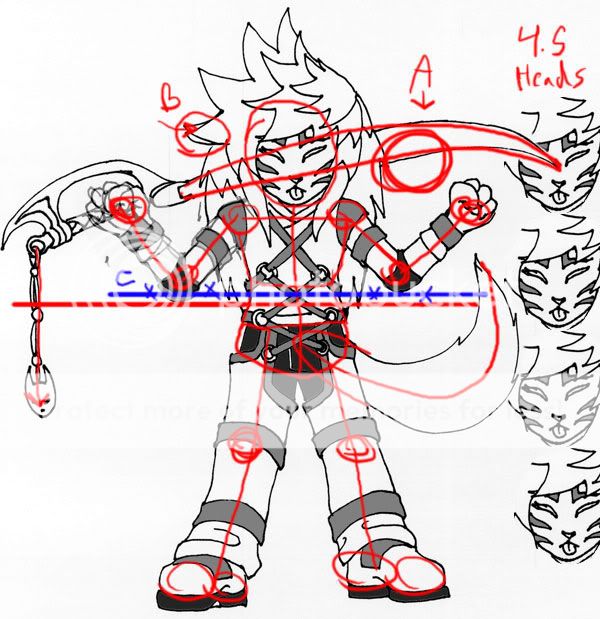
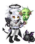
First off, I want to say that MOST of the lines were for me, to make sure that everything is either lining up or trying to figure out proportions/anatomy underneath. (Sometimes when I do redlines, with all those lines ppl think "good god I really messed up!" :3
The first thing I noticed was that the character was approx 4.5 heads tall. Gaia characters tend to be large headed, as do many anime characters as the face is expressive and larger features push emotions further. However, some artists fall into that as their default proportions- real proportions are more around six heads high (for an adult), while idealized superheros get to around 8 heads high. Not something wrong, just something to keep in mind :3
A. When I sketch things I draw them all the way across- even if I can't see it. It makes sure I get the angles right. With the current angle of the bottom of the blade the line would end up closer to her shoulder than the sword hilt. There is the possibility that there's some funky pattern in the blade covered by her shoulder, but I'm going by what I can see and my general knowledge of straight lines. :3
B. Next I noticed the bit in the hair. It looks like you drew the hair, and then redraw over it as you wanted the point looking a bit different. You're probably aware of this already, but since I saw it I decided to point it out.
C. One arm seems to be longer than the other. If the figure were turned I wouldn't be able to do this, as distance makes things things appear smaller than they are. But since she is facing straight forward and the angle on the arms and the figure is standing straight up the elbows should hit the same point vertically.
If you look at the pose, it is fairly symmetrical. The tail and sword helps to counter that a bit. The figure looks at you straight on. I think my biggest qualm with this is figures that look at you straight on can easily develop "cardboard cutout syndrome" meaning characters will look flatter and less proportionate. Turning a figure just a bit gives it more depth and can help it look my dynamic.
I like how you redrew the features of each side. So many artists would get lazy and copy+paste and flip. Ugh. I think not copying brings it to a higher quality.
Hope that was helpful and made sense. :3