|
|
|
|
|
|
|
|
|
 Posted: Tue Apr 03, 2012 4:19 pm Posted: Tue Apr 03, 2012 4:19 pm
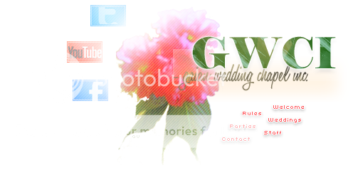
This is my (not quite finished) entry for the homepage design contest.
Theme: Spring. Pictures => Mine.
All made using (I kid you not) the joystick on my keypad. (for those of
you who don't know, it's that small red nub on older non-apple computers)
So can I have advice or opinions, please?xxxxxxx - 
|
 |
|
|
|
|
|
|
|
|
|
|
|
|
|
Posted: Wed Apr 04, 2012 6:25 am
How do you make something like that with a joystick!? I had to use one for about a month, and I learned more keyboard shortcuts then than for the rest of my life.
Back to the layout... sweatdrop
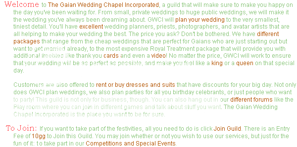
The mint green is a tad bit difficult to read. Maybe find a different green in the picture and use that?
Because I'm a grammar freak, I would like it to read "The price>,< you ask?"
And finally, it could be because of how light the mint green is, but the browner words seem to pop out at you, and then they don't make sense read together. You could highlight words that form a sentence read together, like 'GWCI will prepare an amazing wedding at whatever cost you choose,' or adjust the color contrast so that they don't seem to be special words. When I see the highlighted words, I tend to think 'Oh, it's something special,' and then it's just another word...
Yeah. Long critique. But I really do like it, it's just that you asked or criticism. Right?
|
|
|
|
|
|
|
|
|
|
|
|
|
|
|
|
|
|
Posted: Wed Apr 04, 2012 5:32 pm
I really like the look overall: Easily readable, good color scheme, and I love the flower. So far, very nice job. The only word I think shouldn't be colored in the brown would be "cards" simply because it's really plain and doesn't stand out in relation to all the other words. Overall, good job, but after reading this over and over, I'll probably need to revise the intro. emotion_bigheart
|
|
|
|
|
|
|
|
|
|
|
|
|
|
|
Posted: Wed Apr 04, 2012 5:46 pm
Skye Reisato How do you make something like that with a joystick!? I had to use one for about a month, and I learned more keyboard shortcuts then than for the rest of my life. Back to the layout... sweatdrop The mint green is a tad bit difficult to read. Maybe find a different green in the picture and use that? Because I'm a grammar freak, I would like it to read "The price >, < you ask?" And finally, it could be because of how light the mint green is, but the browner words seem to pop out at you, and then they don't make sense read together. You could highlight words that form a sentence read together, like 'GWCI will prepare an amazing wedding at whatever cost you choose,' or adjust the color contrast so that they don't seem to be special words. When I see the highlighted words, I tend to think 'Oh, it's something special,' and then it's just another word... Yeah. Long critique. But I really do like it, it's just that you asked or criticism. Right?
How, you ask? Through immense patience, and a very cramped index finger.
Mostly because my beloved tablet is under lock and key. ;.;
I noticed that too. It used to be worse, believe me. It used to be this vomit-
shade. I'll play around some more with the colour, I suppose. But I did that
part (the text bit) all in microsoft paint, so I really, really don't want to. xD
I really, really appreciate the criticism, though. I'll change it, believe me. I'll
just complain about it a lot first. xDxxxxxxx -
|
|
|
|
|
|
|
|
|
|
|
|
|
|
|
|
|
|
Posted: Wed Apr 04, 2012 5:47 pm
Saiuri Kamiya I really like the look overall: Easily readable, good color scheme, and I love the flower. So far, very nice job. The only word I think shouldn't be colored in the brown would be "cards" simply because it's really plain and doesn't stand out in relation to all the other words. Overall, good job, but after reading this over and over, I'll probably need to revise the intro. emotion_bigheart
Thank you. 3nodding
If you want to revise the intro after I submit my entry, by all means. Not a
moment before, though. It means more work for me. xDxxxxxxx -
|
|
|
|
|
|
|
|
|
|
|
|
|
|
|
Posted: Wed Apr 04, 2012 5:55 pm
Aryvane Saiuri Kamiya I really like the look overall: Easily readable, good color scheme, and I love the flower. So far, very nice job. The only word I think shouldn't be colored in the brown would be "cards" simply because it's really plain and doesn't stand out in relation to all the other words. Overall, good job, but after reading this over and over, I'll probably need to revise the intro. emotion_bigheart
Thank you. 3nodding
If you want to revise the intro after I submit my entry, by all means. Not a
moment before, though. It means more work for me. xDxxxxxxx -
|
|
|
|
|
|
|
|
|
|
|
|
|
|
|
|
|
|
Posted: Wed Apr 04, 2012 5:59 pm
Saiuri Kamiya Aryvane Saiuri Kamiya I really like the look overall: Easily readable, good color scheme, and I love the flower. So far, very nice job. The only word I think shouldn't be colored in the brown would be "cards" simply because it's really plain and doesn't stand out in relation to all the other words. Overall, good job, but after reading this over and over, I'll probably need to revise the intro. emotion_bigheart
Thank you. 3nodding
If you want to revise the intro after I submit my entry, by all means. Not a
moment before, though. It means more work for me. xDxxxxxxx -
I love you. Marry me. Join my harem. B)xxxxxxx -
|
|
|
|
|
|
|
|
|
|
|
|
|
|
|
Posted: Wed Apr 04, 2012 6:00 pm
Aryvane Saiuri Kamiya Aryvane Saiuri Kamiya I really like the look overall: Easily readable, good color scheme, and I love the flower. So far, very nice job. The only word I think shouldn't be colored in the brown would be "cards" simply because it's really plain and doesn't stand out in relation to all the other words. Overall, good job, but after reading this over and over, I'll probably need to revise the intro. emotion_bigheart
Thank you. 3nodding
If you want to revise the intro after I submit my entry, by all means. Not a
moment before, though. It means more work for me. xDxxxxxxx -
I love you. Marry me. Join my harem. B)xxxxxxx -
|
|
|
|
|
|
|
|
|
|
|
|
|
|
|
|
|
|
Posted: Wed Apr 04, 2012 6:01 pm
Saiuri Kamiya Aryvane Saiuri Kamiya Aryvane Saiuri Kamiya I really like the look overall: Easily readable, good color scheme, and I love the flower. So far, very nice job. The only word I think shouldn't be colored in the brown would be "cards" simply because it's really plain and doesn't stand out in relation to all the other words. Overall, good job, but after reading this over and over, I'll probably need to revise the intro. emotion_bigheart
Thank you. 3nodding
If you want to revise the intro after I submit my entry, by all means. Not a
moment before, though. It means more work for me. xDxxxxxxx -
I love you. Marry me. Join my harem. B)xxxxxxx -
emotion_awesome xxxxxxx -
|
|
|
|
|
|
|
|
|
|
|
|
|
|
|
|
|
|