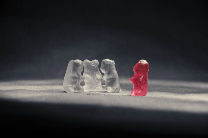
Kai_Chi
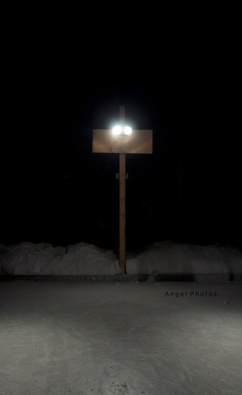
I really like all of them to be honest : 3 all of them grabed my attention. Accept the fifth pic the on of the lights on the sign shinning in the middle. I loved the concept but I think the use of 3/4 rule instead of subject being dead center could have improved it... Other than that, theese are really beautiful pics : D !!!! I love them all!!!!
Thanks so much ^_^
And yeah I realize the rule of thirds could have been used. But sometimes I like to break that rule to make things different.
Dead centre is not something people generally like, which is why I enjoy breaking the 'rule' in certain cases
smile It adds a bit of excitement to the photo in my mind.
Instead of off to the side it is just RIGHT THERE. You HAVE to look at it because it is in the centre.
If it was offset more than there would have been more to see, rather than the black space behind. Setting it to the side would have lightened the darkness, making the light stand out less.
To me this is the main idea and I wanted that light to stand out like a sore thumb.
smile
