| Are You a Flamer? |
| Yes |
|
7% |
[ 12 ] |
| No |
|
18% |
[ 28 ] |
| Pff, I'm just a lonely poll whore. |
|
29% |
[ 45 ] |
| THIS. IS. SPARTA! |
|
45% |
[ 70 ] |
|
| Total Votes : 155 |
|
|
|
|
|
|
|
|
 Posted: Tue Jul 14, 2009 6:27 pm Posted: Tue Jul 14, 2009 6:27 pm
It's a great combination of teal and maroon. Great use of the clutch items.
I feel like you need something on your face,maybe a tattoo or different eyes. Other than that great job.
|
 |
|
|
|
|
|
|
|
|
|
|
|
|
|
Posted: Tue Jul 14, 2009 7:20 pm
The only thing I question is the hairstyle. It seems awfully flyaway for the rest of the avatar. It doesn't look bad, though, just a tad out-of-place. otherwise, you are the picture of class and taste. biggrin
|
|
|
|
|
|
|
|
|
|
|
|
|
|
|
|
|
|
Posted: Tue Jul 14, 2009 11:52 pm
You're all glitter and stardust! The eyes don't really seem to blend, but other than that it's great!
|
|
|
|
|
|
|
|
|
|
|
|
|
|
|
Posted: Wed Jul 15, 2009 8:30 am
Thanks. I wanted to look kind of like a "creature of the night," but not a vampire.
I like your theme, but I think the boots could be more cohesive. Other than those (which aren't really your fault,) I think you've got a super cute outfit. biggrin
|
|
|
|
|
|
|
|
|
|
|
|
|
|
|
|
|
|
Posted: Wed Jul 15, 2009 9:50 am
You know, now that I think of it, the eyes could be like creepy eyes peering out at you in the darkness. You know, in movies when you just see eyes looking at you from the bushes or something...?
Anyways, I still think it's pretty awesome. mrgreen
|
|
|
|
|
|
|
|
|
|
|
|
|
|
|
Posted: Wed Jul 15, 2009 11:56 am
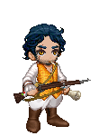
It's all Renaissance steam punk goodness. The colors come together well and it's more character like. Get rid of the hat though.
|
|
|
|
|
|
|
|
|
|
|
|
|
|
|
|
|
|
Posted: Thu Jul 16, 2009 12:01 am
Very Gothic Lolita, but is the cane necessary? Perhaps some sort of plush or the like would work better?
|
|
|
|
|
|
|
|
|
|
|
|
|
|
|
Posted: Thu Jul 16, 2009 1:11 am
You took my suggestion! I'm honored, I love the overall look of this right now, the strap of your sword sets everything off nicely, and the Red Plus on your forehead is a nice contrast, I'm not sure I would change anything from this avatar.
|
|
|
|
|
|
|
|
|
|
|
|
|
|
|
|
|
|
Posted: Thu Jul 16, 2009 8:58 pm
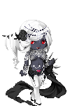
Creepy, but fabulous. I like the contrast between the red details and the yellow eyes, it lends the face more weight... I also like the use of the Fremere hair. biggrin The only thing I can see that isn't awesome is the devil wings around the ankle - they're too simple-looking for my taste. I'd have liked to see some industrial-looking boots or an interesting, creepy backdrop item there instead. pickle relish You know, now that I think of it, the eyes could be like creepy eyes peering out at you in the darkness. You know, in movies when you just see eyes looking at you from the bushes or something...? Anyways, I still think it's pretty awesome. icon_mrgreen.gif Why thank you. That was kind of what I wanted, like when you're looking around the darkness and see an animal's glowing eyes and it just reminds you that you can't see at all, and that you're in terrible danger. xd
|
|
|
|
|
|
|
|
|
|
|
|
|
|
|
Posted: Fri Jul 17, 2009 9:13 am
Steph: She is a living constellation. biggrin
Mystic. I love it. :3 I like how you sort of blend a bit with the background but stick out enough to be a definite figure.
|
|
|
|
|
|
|
|
|
|
|
|
|
|
|
|
|
|
Posted: Fri Jul 17, 2009 10:09 am
Thanks. whee
For yours, I like your overall look. The black makes the colors pop, and the green/red combo is both classic and tastefully done. I love the textured look that your items give your body. The only thing I don't adore are the squiggly lines above your head - I think it's the wrong shade of green, but then again, it helps bring the focus in a neat circle around your avi. Good work. biggrin
|
|
|
|
|
|
|
|
|
|
|
|
|
|
|
Posted: Fri Jul 17, 2009 10:22 am
I love the Night time feel i get with your avi. its lovely
|
|
|
|
|
|
|
|
|
|
|
|
|
|
|
|
|
|
Posted: Fri Jul 17, 2009 1:02 pm
It's a set. Of course it matches and goes well together. Zero points for creativity, though.
I would try to achieve the same look with pieces from different sets.
|
|
|
|
|
|
|
|
|
|
|
|
|
|
|
Posted: Fri Jul 17, 2009 1:51 pm
Taeryyn It's a set. Of course it matches and goes well together. Zero points for creativity, though. I would try to achieve the same look with pieces from different sets. -smirks- here. better? this is my normal avi.
|
|
|
|
|
|
|
|
|
|
|
|
|
|
|
|
|
|
Posted: Fri Jul 17, 2009 2:15 pm
@ Tae - I love your current avatar. It has a nice flow and good color balance~
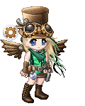
@ organization_13_gurl - Makes for a nice "character avatar" although some of the clothing elements seem out of place. Like that hat....it doesn't really go with the rest.
|
|
|
|
|
|
|
|
|
|
|
|
|
|