| Are You a Flamer? |
| Yes |
|
7% |
[ 12 ] |
| No |
|
18% |
[ 28 ] |
| Pff, I'm just a lonely poll whore. |
|
29% |
[ 45 ] |
| THIS. IS. SPARTA! |
|
45% |
[ 70 ] |
|
| Total Votes : 155 |
|
|
|
|
|
|
|
|
 Posted: Wed May 13, 2009 7:50 pm Posted: Wed May 13, 2009 7:50 pm
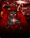
well to start I'd like to say that i love the gold and white, unfortunately the hilt of the swords breaks that wonderful theme, and though it dose go with your cute little flaming friend there that's about all it goes with
|
 |
|
|
|
|
|
|
|
|
|
|
|
|
|
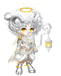
Posted: Fri May 15, 2009 8:47 pm
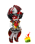
Simple and dark. I like it, though I think it needs some other fire bit to the right to balance it out.
|
|
|
|
|
|
|
|
|
|
|
|
|
|
|
|
|
|
Posted: Sat May 16, 2009 3:08 am
A nice color combo Pisces has going on there, I approve 3nodding
|
|
|
|
|
|
|
|
|
|
|
|
|
|
|
Posted: Sat May 16, 2009 8:51 am
I like the general look you have going on, kind of looks like an avenging angel/demon from hell x3, but it's a bit unbalanced. I think some darker shoes would actually make a world of difference, and perhaps a different belt. Normally I'd say you need some other source of red, what with the eyes, but the way you have it now, they stand out better and are the real focal point of the avatar. ^^
|
|
|
|
|
|
|
|
|
|
|
|
|
|
|
|
|
|
Posted: Sat May 16, 2009 2:45 pm
It is a good black and orange avi Taeryyn. I don't like the goddess gift neckless, because the gold stands out too much.
|
|
|
|
|
|
|
|
|
|
|
|
|
|
|
Posted: Sat May 16, 2009 2:57 pm
|
|
|
|
|
|
|
|
|
|
|
|
|
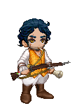
Posted: Sat May 16, 2009 6:13 pm
Sano!!! I liked him immensely biggrin
Kusa you look like you've just walked back from the dead and that walking coal sprite looks scared out of its flaming little mind by you! I wouldn't change a thing.
|
|
|
|
|
|
|
|
|
|
|
|
|
|
|
Posted: Sun May 17, 2009 4:18 pm
Back to Elcia classic I see, I like the dress you choose to base this one off of. (I get so many of the silky dresses I think the servers think I'm female xd ) I wouldn't change anything if I were you.
|
|
|
|
|
|
|
|
|
|
|
|
|
|
|
|
|
|
Posted: Sun May 17, 2009 7:26 pm
Very colorful, and I can't really see any thematic problems. Maybe a background would help, but then there would be quite a lot of green... I don't think I can fault this one.
|
|
|
|
|
|
|
|
|
|
|
|
|
|
|
Posted: Mon May 18, 2009 1:46 pm
needs a little pop. seems a bit bland to me. You need some kind of focal point.
|
|
|
|
|
|
|
|
|
|
|
|
|
|
|
|
|
|
Posted: Mon May 18, 2009 1:54 pm
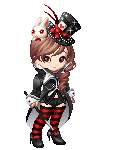
The ribbons on the stockings really detract from the overall look. I like that you have some red down there, but it's too much and is too frilly.
|
|
|
|
|
|
|
|
|
|
|
|
|
|
|
Posted: Mon May 18, 2009 2:51 pm
|
|
|
|
|
|
|
|
|
|
|
|
|
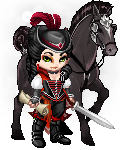
Posted: Mon May 18, 2009 3:17 pm
I like everything BUT the spear and the thing beside you, other than that, everything's A-OK
|
|
|
|
|
|
|
|
|
|
|
|
|
|
|
Posted: Mon May 18, 2009 4:58 pm
I do like the look you have, it has potential, however that means it also isn't "Done" in my eyes, it seems like you need a little more. It seems to me like you need something else on your chest/stomach area, something to draw or add to the tattoos you already have.[/myTwoCents]
|
|
|
|
|
|
|
|
|
|
|
|
|
|
|
|
|
|
Posted: Mon May 18, 2009 6:17 pm
Very nice. I'm really liking all the colors 3nodding Though I do wish your little buddy had some more green or blue so he could match. But that's something beyond your control so oh well.
|
|
|
|
|
|
|
|
|
|
|
|
|
|