|
|
|
|
|
|
|
|
|
 Posted: Mon Jul 12, 2010 11:51 pm Posted: Mon Jul 12, 2010 11:51 pm
Mademoiselle Alvinette Ethereal Darkness Yeah-yuh :3 I love my dinner date XD~ That avi is epic! blaugh
Wakakaka, I feel like hades. *lulz Greek mythology is funny*
|
 |
|
|
|
|
|
|
|
|
|
|
|
|
|
Posted: Tue Jul 13, 2010 1:59 pm
This is what I made this afternoon. There are still a couple of spots where I can plug people in they would like. Tell me what you think! It wasn't that hard to put together once I got all of the avi's, so I can make changes before it is finalized if necessary. 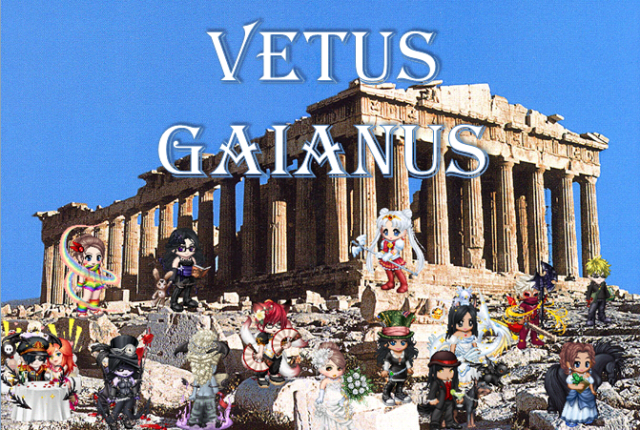
|
|
|
|
|
|
|
|
|
|
|
|
|
|
|
|
|
|
Posted: Tue Jul 13, 2010 2:00 pm
YAY! New banner! whee heart
|
|
|
|
|
|
|
|
|
|
|
|
|
|
|
Posted: Tue Jul 13, 2010 5:39 pm
Mademoiselle Alvinette YAY! New banner! whee heart Do you have any thoughts on it or suggestions to improve it?
|
|
|
|
|
|
|
|
|
|
|
|
|
|
|
|
|
|
Posted: Tue Jul 13, 2010 8:40 pm
I dunno. It seems like the avis kind of blend into the background. Is there a way to make the background a little lighter or something so there's more of a contrast between the background and the avis? Positioning and everything is perfect, though. 3nodding You did great!
|
|
|
|
|
|
|
|
|
|
|
|
|
|
|
Posted: Tue Jul 13, 2010 10:03 pm
Mademoiselle Alvinette I dunno. It seems like the avis kind of blend into the background. Is there a way to make the background a little lighter or something so there's more of a contrast between the background and the avis? Positioning and everything is perfect, though. 3nodding You did great! I'm not sure. confused I pasted the pictures in using Microsoft Paint, and I made a snazzy title using word art in PowerPoint. sweatdrop (Then I zoomed in and took a screen shot of the final product in PowerPoint, and then I uploaded it.) There might be something on PowerPoint where you can lighten the background. I'll have to check.
|
|
|
|
|
|
|
|
|
|
|
|
|
|
|
|
|
|
Posted: Wed Jul 14, 2010 2:05 pm
it looks niiiiice mrgreen
|
|
|
|
|
|
|
|
|
|
|
|
|
|
|
Posted: Wed Jul 14, 2010 6:42 pm
It looks good, I agree about lightening up the background. I don't know anything about the photoshop type things, but my hubby has a lot of experience with it. I might be able to ask him.....
|
|
|
|
|
|
|
|
|
|
|
|
|
|
|
|
|
|
Posted: Wed Jul 14, 2010 10:59 pm
I approve.
ISHHH AWWWWWWWWSUMMMMMANNGOOOO
|
|
|
|
|
|
|
|
|
|
|
|
|
|
|
Posted: Wed Jul 14, 2010 11:48 pm
Thank you for your feedback! This was a trial run, so I will be making another attempt when I get back. I plan on doing the same thing as far as layout is concerned, but I will be inserting Scythe into the banner eventhough he didn't submit an avi because he is a fun and active member of this guild. I will search for a way to get the background a degree lighter. I'm sure there is a way to do it with the technology that I'm working with. I just need to play around with it a little. I will be leaving in the morning to visit my grandmother, and I won't be back until Saturday. Until then, I will be without internet access. Either Saturday or Sunday, I will do version 2 of the banner, and hopefully that will be the final version. In the mean-time, if there is any other member you think should be on the banner, feel free to badger them to submit an avi. They don't have to have posted 50 times in the guild, but I would prefer that they have at least 10 posts so some people in the guild might actually remember seeing them around. Thank you for all of your contributions and support, and I look forward to seeing you when I return. biggrin
|
|
|
|
|
|
|
|
|
|
|
|
|
|
|
|
|
|
Posted: Thu Jul 15, 2010 9:12 pm
Chibi, I absolutely LOVE the new banner. It's pretty spiffy lookin if I do say so myself. hehe. heart =]
|
|
|
|
|
|
|
|
|
|
|
|
|
|
|
Posted: Fri Jul 16, 2010 12:10 am
Wooo bannerific. Looks good.
I'm in there, all holding an axe and stuff.
Just how I wanted to look xd
Ok, I'm just being slightly crazy, since it's after midnight now, but yeah, it's good and I like it.
|
|
|
|
|
|
|
|
|
|
|
|
|
|
|
|
|
|
Posted: Fri Jul 16, 2010 5:13 pm
Chibi you are awesome and the banner is lookin good I do also agree with the color of the background but other than that looks good keep up the good work chicka biggrin
|
|
|
|
|
|
|
|
|
|
|
|
|
|
|
Posted: Sat Jul 17, 2010 5:23 pm
Thanks for all of your input! I just got back, and I'm kind of tired out, so I think I will get to it tomorrow. I just feel like kicking back with a book tonightl. I was thinking about making the edges of the picture do the fade effect, but I would be cutting ED's face in half if I did that on the first try. I will try to reposition everyone so that I can fade the edges and make it look spiffy! biggrin
|
|
|
|
|
|
|
|
|
|
|
|
|
|
|
|
|
|
Posted: Sun Jul 18, 2010 9:14 pm
I ended up doing the whole thing on PowerPoint 2007. I rarely use it, so it only occurred to me in the past few months that I can do image editing with it. lol I have changed the arrangement slightly to add more people. I tried to make the ones in the back look slightly smaller to suggest depth, but I didn't make them to scale because I didn't want anyone to feel too left out. I have two versions ready to go. Tell me which one you like better and let me know if there is anything else that needs to be changed. Version 1 - The background has been lightened to 10% 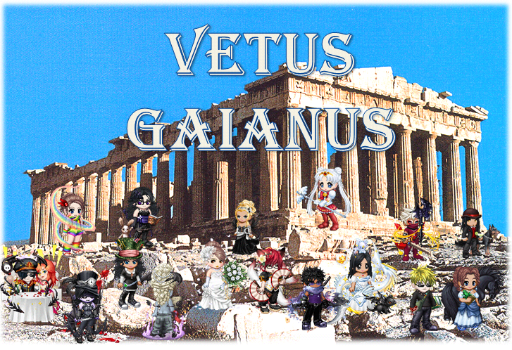 Version 2 - The background has been lightened to 20% 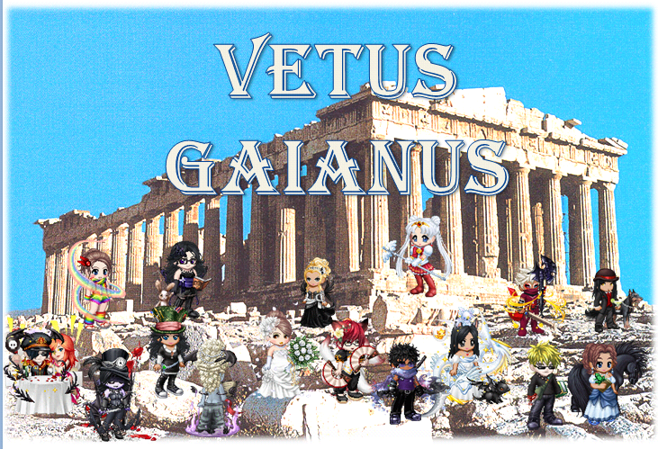 If you don't like either of these, I can lighten it to 30%, but anything beyond that just looks weird.
|
|
|
|
|
|
|
|
|
|
|
|
|
|
|
|
|
|