| Are You a Flamer? |
| Yes |
|
7% |
[ 12 ] |
| No |
|
18% |
[ 28 ] |
| Pff, I'm just a lonely poll whore. |
|
29% |
[ 45 ] |
| THIS. IS. SPARTA! |
|
45% |
[ 70 ] |
|
| Total Votes : 155 |
|
|
|
|
|
|
|
|
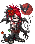
 Posted: Thu Jul 31, 2008 10:14 pm Posted: Thu Jul 31, 2008 10:14 pm
The subtle color combos work really well with the gold trim on most of your stuff. Nicely done.
Edit: apparently you changed your avatar just as I posted this... now you have the scythe that draws most of the attention (Which is good in this case), and your Mythrill armor feels out of place.
|
 |
|
|
|
|
|
|
|
|
|
|
|
|
|
Posted: Thu Jul 31, 2008 11:13 pm
How mythical of you, Kusa. :3
The only thing I would critique is the wings. The golds of the wings just seem to overwhelm a bit, probably because the clothing on your centaur is mostly black.
|
|
|
|
|
|
|
|
|
|
|
|
|
|
|
|
|
|
Posted: Thu Jul 31, 2008 11:36 pm
The concept is very soft and unified- it just gets a little busy near the sides and chest, but I'm not at all perturbed.
It's lovely. ;D
|
|
|
|
|
|
|
|
|
|
|
|
|
|
|
Posted: Fri Aug 01, 2008 1:07 am
Oh goodness there's a lot of wings there...
Not necessarily a bad thing though...
Though I would say take out the devil imp (it sorta seems in the way) and perhaps one of the things on your head. I'm not sure if its the bird or the flower that irks me just a bit...
Overall, it's dark and lovely ^.^
|
|
|
|
|
|
|
|
|
|
|
|
|
|
|
|
|
|
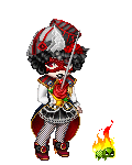
Posted: Fri Aug 01, 2008 3:46 pm
very good lots of fire...hooray fire
|
|
|
|
|
|
|
|
|
|
|
|
|
|
|
Posted: Fri Aug 01, 2008 3:57 pm
Pendragon.
The thread is called Critique the Avatar above you.
A rule you say one thing off with the avatar above you. Not say it's nice to get gold.
The Axe thing is purple and so it clashes with the theme you have.
|
|
|
|
|
|
|
|
|
|
|
|
|
|
|
|
|
|
Posted: Fri Aug 01, 2008 6:15 pm
I like what you did with ur avi, its just the head seems like the only thing that could use a slight tweak, but that's up to you...
|
|
|
|
|
|
|
|
|
|
|
|
|
|
|
Posted: Fri Aug 01, 2008 6:20 pm
Totally creepy! Great look...but I don't want to run into you in any dark alleys. Death gives me the the chills...brr!
|
|
|
|
|
|
Profitable Conversationalist
|
|
|
|
|
|
|
|
|
|
|
|
Posted: Fri Aug 01, 2008 7:43 pm
i don't like the fox...not sure why
|
|
|
|
|
|
|
|
|
|
|
|
|
|
|
Posted: Fri Aug 01, 2008 10:54 pm
As already mentioned, the axe is the only offsetting thing about your avatar.
|
|
|
|
|
|
|
|
|
|
|
|
|
|
|
|
|
|
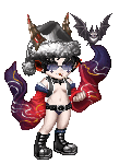
Posted: Thu Aug 14, 2008 2:27 pm
the wings kinda clash with the black but the feet work well with your hair and the the flute
|
|
|
|
|
|
|
|
|
|
|
|
|
|
|
Posted: Fri Aug 15, 2008 7:42 pm
It would probably work better without the wings and... what is that thing on your arm, anyway?
|
|
|
|
|
|
|
|
|
|
|
|
|
|
|
|
|
|
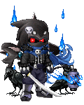
Posted: Sat Aug 16, 2008 1:01 am
It's always difficult for me to find something I don't like about your avi's Erv, but the one thing that stands out for me at the moment is the lacking space in your hands.
|
|
|
|
|
|
|
|
|
|
|
|
|
|
|
Posted: Sat Aug 16, 2008 10:58 am
Hmmm, I'd say get rid of the sunglasses. Sunglasses and an eyepatch is just... Meh =/
Also, I don't know... but something about it overall just seems a bit off... Maybe choose one color of punch or something?
|
|
|
|
|
|
|
|
|
|
|
|
|
|
|
|
|
|
Posted: Sat Aug 16, 2008 6:28 pm
I like it, though since you need a critique I'll have to give one. The only thing I don't quite find matching is the headband. It's a little too cool-coloured compared to the blacks that you are wearing.
|
|
|
|
|
|
|
|
|
|
|
|
|
|