|
|
|
|
|
|
|
 Posted: Thu Mar 01, 2007 9:24 pm Posted: Thu Mar 01, 2007 9:24 pm
Tir is too popular for me x'D
|
 |
|
|
|
|
|
|
|
|
|
|
|
|
|
Posted: Fri Mar 02, 2007 12:08 am
Hey, this a bit of a recent pic. What's your idea of it? 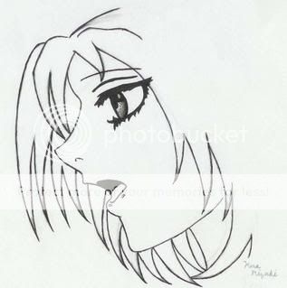
|
|
|
|
|
|
|
|
|
|
|
|
|
|
|
|
|
|
Posted: Fri Mar 02, 2007 2:01 am
Hey Kenaserentiy smile Well the most glaring mistake is that her head is too flat up top. No one should have a skull that flat XD; Here's a drawing to show what I mean: http://img.photobucket.com/albums/v198/nini206/redline/Kenaserenity1.jpgThe red line is her skull. Remember that eyes are approximately halfway between the chin and the top of the head. Her nose and mouth profile are pretty good though :]... I would say work a bit on showing hair texture because right now it looks veryspikey and stiff, but that could be a style issue. Btw, did you use a reference for this?
|
|
|
|
|
|
|
|
|
|
|
|
|
|
|
Posted: Fri Mar 02, 2007 2:02 am
Soap Predator Tir is too popular for me x'D
YOU JUST TOO POOPY FO' ME talk2hand
|
|
|
|
|
|
|
|
|
|
|
|
|
|
|
|
|
|
Posted: Fri Mar 02, 2007 7:00 am
Actually, yeah, I did use a reference.
I was watching Bleach on my laptop to catch up on the latest, and I paused for a moment, catching one of the characters in profile. biggrin It was a shock to me that I caught it right then, so I improvised by trying to get the main shape.
I couldn't quite see much of the forehead though. razz So I tried to do my best, and this was the turnout.
Good catch on the head thing- I couldn't really understand how to fix it. xp
|
|
|
|
|
|
|
|
|
|
|
|
|
|
|
Posted: Fri Mar 02, 2007 7:09 am
XD!
I can usually tell when people use another anime picture as a reference...
Anyhow, like I said the profile part is awesome, just work on understanding the basic head shape and sticking hair on it : D <3
|
|
|
|
|
|
|
|
|
|
|
|
|
|
|
|
|
|
Posted: Fri Mar 02, 2007 8:12 pm
Hey I retouched "Don't Fall"! I made his hood longer, removed the fire, and took out the Billy-Jean sidewalk glow xD. Yeah, I put glowing spheres instead of the fire whee . Dont Fall Numba II
|
|
|
|
|
|
|
|
|
|
|
|
|
|
|
Posted: Fri Mar 02, 2007 8:15 pm
Wow! I love your coloring on the pic! It's beautiful! xd
|
|
|
|
|
|
|
|
|
|
|
|
|
|
|
|
|
|
Posted: Fri Mar 02, 2007 8:38 pm
|
|
|
|
|
|
|
|
|
|
Posted: Fri Mar 02, 2007 8:53 pm
Mellow Noise Hey I retouched "Don't Fall"! I made his hood longer, removed the fire, and took out the Billy-Jean sidewalk glow xD. Yeah, I put glowing spheres instead of the fire whee . Dont Fall Numba II
Hello again whee
I do like this second version much better biggrin !
The background doesn't look half as akward. The lighting is also better.
What's bothering me at this point is where the shapes meet. Like where his hand touches her shirt and where her sleeves lie on his shirt. I think it's still a little too distinct, like shapes drawn seperately then put together. Try putting just a little more shadow in those areas... I'm actually not quite sure how to fix it sweatdrop
Ahyhow awesome job again on the coloring biggrin
p.s. the sidewalk still ends funny XD... maybe have it wander off in the distance? fade off? bend a bit?
|
|
|
|
|
|
|
|
|
|
|
|
|
|
|
|
|
|
Posted: Fri Mar 02, 2007 9:17 pm
T i r a e l What's bothering me at this point is where the shapes meet. Like where his hand touches her shirt and where her sleeves lie on his shirt. I think it's still a little too distinct, like shapes drawn seperately then put together. Try putting just a little more shadow in those areas... I'm actually not quite sure how to fix it sweatdrop OH I think i see what you mean. That's okay. I'll spend more time on that part of the picture then (and elsewhere where I catch this)... Haha thanks and for the suggestion biggrin . Floating sidewalk whee xd whee
|
|
|
|
|
|
|
|
|
|
|
|
|
|
|
Posted: Fri Mar 02, 2007 9:36 pm
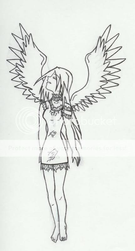 Hey, could you give me some suggestions on the proportions of this drawing? confused Sorry its so big. BTW, I'm fixing the face with the flat head, and it looks much better than before. blaugh
|
|
|
|
|
|
|
|
|
|
|
|
|
|
|
|
|
|
Posted: Fri Mar 02, 2007 9:54 pm
Hello again:] very cute angel biggrin and I love her expression. redline: http://img.photobucket.com/albums/v198/nini206/redline/kenaserenity2.jpgSome main things I would like to point out: 1. her arms are too thick 2. her knees don't meet at the same place 3. feet too small 4. the back of her head is just a tad too flat wink 5. The 'folds' on her dress look like they're a bunch of random wrinkles from nowhere. Remember that folds come from cloth pulling against the skin. Your proportions actually aren't bad O: her arms and legs are pretty much the right length. The only thing I have to say is her head looks a bit large to be on her body. I think at this point it would be good for you to look at some anatomy tutorials and work on human strucure :] The main section of the guild has a nice sticky with a lot of tutorials you can choose from. But it will help alot when drawing later. Also try drawing basic shapes for the body or a wire frame before fleshing it out :3.
|
|
|
|
|
|
|
|
|
|
|
|
|
|
|
Posted: Sat Mar 03, 2007 12:33 pm
I'll try looking at those. smile
And I'll try to downsize my girl's ego. xd
I always have problems with the feet whenevr I draw them... I guess that I'll need to work on that. sweatdrop
|
|
|
|
|
|
|
|
|
|
|
|
|
|
|
|
|
|
Posted: Sat Mar 03, 2007 12:47 pm
XD I find feet hard to do too... I guess the best way is to get some references and just draw them :]
|
|
|
|
|
|
|
|
|
|
|
|
|
|