|
|
| Out of 5, what do you rate me? |
| 5/5 |
|
6% |
[ 1 ] |
| 4/5 |
|
25% |
[ 4 ] |
| 3/5 |
|
31% |
[ 5 ] |
| 2/5 |
|
25% |
[ 4 ] |
| Caca. |
|
12% |
[ 2 ] |
|
| Total Votes : 16 |
|
|
|
|
|
|
|
|
 Posted: Sat Mar 19, 2011 12:41 am Posted: Sat Mar 19, 2011 12:41 am
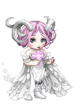
neonchrome Over all, I like it. The flutes just kinda ruin it for me
But in general they're not really part of the avatar. I'm gonna remove them again.
|
 |
|
|
|
|
|
|
|
|
|
|
|
|
|
Posted: Sat Mar 19, 2011 12:43 am
|
|
|
|
|
|
|
|
|
|
|
|
|
Posted: Sat Mar 19, 2011 12:44 am
iSiLVERNAL I personally like the eyes a lot~ (And plus, Oculus Mythica doesn't layer on top of Masterpieces like other eyes do, unfortunately... wink )
The flutes do throw it off a little... But overall, I think your avatar is well put-together! <3
But they're not really part of the avatar. I just forgot do take 'em off yesterday. razz
|
|
|
|
|
|
|
|
|
|
|
|
|
|
|
Posted: Sat Mar 19, 2011 1:52 am
I wouldn't typically like something like that but it looks pretty nice, the colors go together very well, it's more layered than cluttered and it has an oddly sinister look despite not being too dark. I like that.
|
|
|
|
|
|
|
|
|
|
|
|
|
|
|
|
|
|
Posted: Sun Mar 20, 2011 1:19 am
Honestly, too cluttered for my taste. 3/5 only because you've used one of my favorite themes/colors throughout the whole thing.
|
|
|
|
|
|
|
|
|
|
|
|
|
|
|
Posted: Wed Mar 23, 2011 1:00 pm
I gave you a 4/5
I agree with Es, the headband throws it off a bit.
Perhaps a darker blue somewhere at the top?
Also, rate me back? *points to siggy*
|
|
|
|
|
|
|
|
|
|
|
|
|
|
|
|
|
|
|