| Are You a Flamer? |
| Yes |
|
7% |
[ 12 ] |
| No |
|
18% |
[ 28 ] |
| Pff, I'm just a lonely poll whore. |
|
29% |
[ 45 ] |
| THIS. IS. SPARTA! |
|
45% |
[ 70 ] |
|
| Total Votes : 155 |
|
|
|
|
|
|
|
|
 Posted: Tue Sep 22, 2009 4:00 pm Posted: Tue Sep 22, 2009 4:00 pm
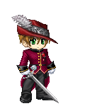
I think the brown monk's robes would work better. THe black is a tidge too black.
|
 |
|
|
|
|
|
|
|
|
|
|
|
|
|
Posted: Tue Sep 22, 2009 4:48 pm
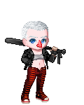
There isn't enough mix of the colors in the avatar
|
|
|
|
|
|
|
|
|
|
|
|
|
|
|
|
|
|
Posted: Tue Sep 22, 2009 7:11 pm
Same as before, though I will agree that some arm tats would bring it together better =]
|
|
|
|
|
|
|
|
|
|
|
|
|
|
|
Posted: Tue Sep 22, 2009 7:32 pm
Perhaps another jacket or different choice of weaponry? Something just seems off to me...
|
|
|
|
|
|
|
|
|
|
|
|
|
|
|
|
|
|
Posted: Tue Sep 22, 2009 9:05 pm
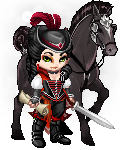
I'm not sure what kind of vibe I'm getting here. I want to say pirate, but it's definitely got a different feel to it. I think it's the fact that you still look like Brandon Flowers =/
Complaint-wise, I don't have much. The rapier doesn't fit too well. Maybe a cutlass or some other, smaller sword?
|
|
|
|
|
|
|
|
|
|
|
|
|
|
|
Posted: Tue Sep 22, 2009 9:18 pm
Very nice, though I suppose I could be all nit-picky and say 'Gr you're wearing a set >=[' but really, it doesn't bother me that much. I do wish the hat was darker though, but you can't really help that.
|
|
|
|
|
|
|
|
|
|
|
|
|
|
|
|
|
|
Posted: Tue Sep 22, 2009 9:23 pm
The Fremere's Guard sash sticks out a bit, but otherwise I like it.
I notice Lemmy is in your thoughts, even though he's not with you. :3
|
|
|
|
|
|
|
|
|
|
|
|
|
|
|
Posted: Wed Sep 23, 2009 7:14 am
So... shiny... O___O Shiiiiiinyyyyyyyyyyy.... whee
And that's all I have to say about that. 3nodding
|
|
|
|
|
|
|
|
|
|
|
|
|
|
|
|
|
|
Posted: Wed Sep 23, 2009 10:08 am
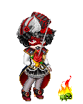
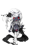
I really like it. The only thing is that the eye... things... bother me a bit. Otherwise, I like the sickly skin and shiny black armor. biggrin
|
|
|
|
|
|
|
|
|
|
|
|
|
|
|
Posted: Wed Sep 23, 2009 11:45 am
I like it though some of it seems a bit much. I'm not sure what you could take out without messing up the whole look though so this critique is kinda useless sweatdrop
Oh and I love your new name 3nodding
|
|
|
|
|
|
|
|
|
|
|
|
|
|
|
|
|
|
Posted: Wed Sep 23, 2009 2:37 pm
It is a good avatar, but it doesn't grab me
|
|
|
|
|
|
|
|
|
|
|
|
|
|
|
Posted: Wed Sep 23, 2009 3:37 pm
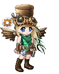
I think the sandals are the wrong color, and I'm not sure I get it... Then again, I can't see anything out-and-out wrong with it, so. Yeah. Good work?
@ Invis: Thanks! I needed a change. :3
|
|
|
|
|
|
|
|
|
|
|
|
|
|
|
|
|
|
Posted: Wed Sep 23, 2009 7:28 pm
Besides the books, everything definitely seems to have its place. For the sake of being concise, however, I have to say that the stacks of books are irrelevant to the rest of your avatar? D:
|
|
|
|
|
|
|
|
|
|
|
|
|
|
|
Posted: Wed Sep 23, 2009 8:02 pm
I agree re: the book, but I like the look of the item. 3nodding
Er, the only real thing that bugs me is that the cape/eyes don't match, and that the white items look blue next to the red. Its colors are a touch schizophrenic. Otherwise, I really like it.
|
|
|
|
|
|
|
|
|
|
|
|
|
|
|
|
|
|
Posted: Fri Sep 25, 2009 2:14 pm
Color combo is good. It's a little top heavy but I think what I'd like to see most is different shoes.
|
|
|
|
|
|
|
|
|
|
|
|
|
|