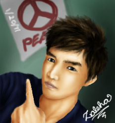
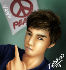
cool drawing : D !!! I like what you've done with it so far, the hair looks crazy good from a thumbnail point of view : )
Ok so things you can do to help improve your pic : ). I suggest adding different tones in your skin. The human body has many suttle colours in the skin that makes it look the way it does. For instance you have a little blue and purple in your skin because of the veins that are close to the skin. You won't see litteraly blue and purple vains but you will get a hint of thoughs colours in the skin that creats a veriety of colours in your skin palette
3nodding Right now your off to a really good start, you've developped your forms and hinted to the type of lighting in your scene, : D which is marvelous ^-^. But the skin looks a little to uniform. The colours look a little like you used the same colour but just a little darker each time to do the shading. Which is normal, I used to do all my drawings in the past like that haha. But it generaly turns out better if you add cold colours like blues, greens and purples in your shading, and warmer colours to contrast in the lighter areas, like pinks, oranges, browns yellows and colours like that for the more eluminated areas : )
Ok I'm not the best example for realism XD as I'm still trying to learn it myself but heres a pic that I did a while ago.
http://i5.photobucket.com/albums/y164/Kai_Chi/rali_04.pngnotice how I tried using purples and greens and a little blue in the shadow parts of the skin, along with pinks and light browns yellows and oranges in the areas where the skin is lighten. Its suttle, its not something thats "in your face XD haha" but its still helps create skin that looks more realistic because our skin naturaly have some of these colours in them.
: 3 so if you can, try that out. Try it on a seperate layer and just go crazy and have fun with it, see what it gives, if you want you can post what it gives after and we can see what it gives : ) Good luck ! ^o^ can't wait to see the end result!!!