- by kisa kitty12 |
- Painting And Drawing
- | Submitted on 09/29/2010 |
- Skip


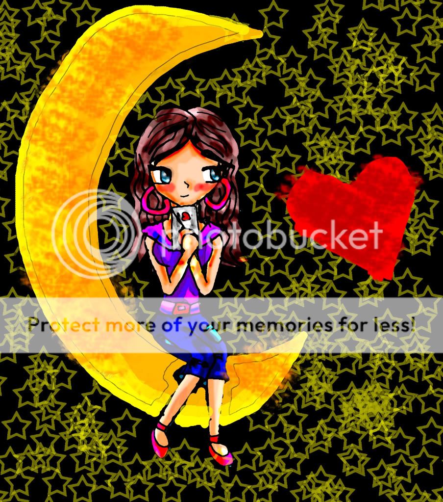
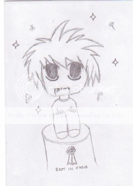
- Title: chibi me
- Artist: kisa kitty12
- Description: ya this is my chibi i made this one on paint also so dont be to mean about the art thx kisa
- Date: 09/29/2010
- Tags: chibi
- Report Post
Comments (6 Comments)

- julialee123 - 10/03/2010
- i think this is very good i really like it keep up the good work
- Report As Spam

- Phantom-of_Winter - 10/01/2010
-
-continued 3-
So you have a lot of work to do if you desire to change this in any way. I hope I was not too harsh to you. Please do not get me wrong, this is not bad at all and I am not trying to be mean. I just want you to improve and make your art more interesting. I hope these tips help for this piece and in your future pieces. 2/5 - Report As Spam
- Phantom-of_Winter - 10/01/2010
-
-continued 2-
If you want to make it more interesting, make some of the circles bigger and smaller and make sure it fits the whole page and maybe fill in the circles with a dark color. The text at the side of the girl (not the text on the shirt) completly ruins it (besides the flat girl). Get rid of the text; have your work express your idea without the use of words (a famous saying that can be compaired to this idea is "show, not tell" wink . - Report As Spam
- Phantom-of_Winter - 10/01/2010
-
-continued 1-
down. The shoulders look stubby, maybe spread it out more. There are some proportions that need to be present in a human, regardless if it is a chibi or not. You should look up the human anatomy for help on anatomy (or maybe just kid approperate anatomy sheets). Lastly, the background. I don't know what you were going for, but making random circles and scribbles doesn't make a more interesting background when they're all cluttered together. - Report As Spam
- Phantom-of_Winter - 10/01/2010
- This picture is... kind of boring and confusing. First, we have a flat drawing of a girl that lacks contrast. The colors are all... flat, nothing really pops at me or looks interesting. I think you should put some shading and highlights into this piece to make the girl pop out more. Now I am not saying just find two other colors to substitute as a shade and highlight I would like to see that you have a whole scale for the shades and highlights. The anatomy... looks disproportional from the neck
- Report As Spam

- WaterWaterWater - 09/29/2010
- good
- Report As Spam