Welcome to Gaia! ::


User Image
User Image
User Image
User Image
User Image
User Image <--final

Collaboration done in oc1.1 with hosuni from deviantart. ^^ We drew it together

Romantic Lunatic

Hey there! I know you from DevART (sorta sweatdrop )

Wonderful piece of art. The only things I find wrong are the faces. The one in the back is a bit flat and could use some dimension to the facial structures. The one in the front, her facial features are wonky with each other and over all don't align with the jaw.

Other than that, it's beautiful! And I love the color contrast.
User Image

Unbeatable Nerd

10,075 Points
  • Grunny Harvester 150
  • Tycoon 200
  • Nerd 50
i agree with Aellos. and i'll add: her nose is not straight, but curver to the right a little
i'm really impressed with your way of colouring!
ooh!! Very nice!!!! I love the concept.
oh wow. CRITIQUES! and yes I mean critiques not criticism. I've gotta say I'm impressed. This place is usually either filled with "ew suck" or "OMG ITS PERFECT" with very little in between. In fact I tend to find the more is wrong with a picture the more people say its perfect. Wonder how that works haha.

This is my first time really trying a painterly style so I know there is a lot that needs work. But thanks guys for the critique.
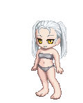
It looks very soft and nice, talking about the skin here. I'm not fond of when artists put white on the lightest part of the skin though :<, I think white ruins the tone of the skin as in real life we have no white shining so brightly on our skin (unless you're bathed in oil or something like that).
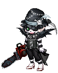
The boys face looks sort of weird, I think it would have been better if some line were drawn where his eye (hidden behind the hair) should be. Instead of just the shadow, or perhaps darker shadow to symbolise an eye socket there or whatever.
The girls hair looks very light, even the linework of the hair. I think you should have included some of that shiny on her skin because right now it looks almost like the hair is a paper cut our placed on top of her skin. If that makes sense razz .
The girls' expression is definitely the best smile , the boy doesn't look as good as her razz .
I think white ruins the tone of the skin as in real life we have no white shining so brightly on our skin.--the character is inhuman and meant to be paler than reality. I use skin tones when painting characters with normal skin. I see where you're coming from of course but it doesnt apply to this image. She's an ice queen and meant to be white like snow.


or perhaps darker shadow to symbolise an eye socket there or whatever. ---its darker since I updated it earlier. I admit I almost covered that side with hair haha *fails* But you are right...I shouldn't take short cuts
touched it up again. Enjoy
Very cool. I love seeing progress stuff and seeing how other artists do their thang. XD!

Quick Reply

Submit
Manage Your Items
Other Stuff
Get GCash
Offers
Get Items
More Items
Where Everyone Hangs Out
Other Community Areas
Virtual Spaces
Fun Stuff
Gaia's Games
Mini-Games
Play with GCash
Play with Platinum